개요

"Use the best bits ES6 and CSS to style your apps without stress" 라는 문구가 눈에 띈다. ES6와 CSS가 어떻게 한 문장에서 함께 쓰일 수 있는 것일까. 그것은 바로 'CSS in JS', 즉 JS 안에서 스타일의 수정을 즉시 가능하도록 하는 Styled Component의 매커니즘 때문이다.
일반적으로 이전까지의 웹 개발 방식은 HTML과 CSS, JS 모듈을 각각 다른 파일에 분리하여 두는 것이 최선의 방책으로 여겨졌으나, React를 필두로 한 컴포넌트 기반의 모던 개발 방식이 인기를 끌면서 한 컴포넌트에서 HTML, CSS, JS를 모두 해결할 수 있는 개발 방식이 주류가 되었다고 한다.
Styled Component의 기본 문법을 보며 찬찬히 모양새를 익혀보도록 하자.
styled-components
Visual primitives for the component age. Use the best bits of ES6 and CSS to style your apps without stress 💅🏾
styled-components.com
설치
# with npm
npm install --save styled-components
# with yarn
yarn add styled-components
React 환경에서는 간단히 npm install styled-component 이름으로 설치가 가능하다
기본 구조
const {컴포넌트 이름} = styled.{태그이름} `{CSS}`;
형식으로 미리 정의를 해두고 사용하는 방식이다.
// import styled from 'styled-components'

const Button = styled.button`
  background: palevioletred;
  border-radius: 3px;
  border: none;
  color: white;
`

const TomatoButton = styled(Button)`
  background: tomato;
`

render(
  <>
    <Button>I'm purple.</Button>
    <br />
    <TomatoButton>I'm red.</TomatoButton>
  </>
)render 부분의 코드가 굉장히 깔끔하다. 당장 <TomatoButton> 이라는 태그 이름만 보아도 "아, 이 버튼은 토마토색 버튼이겠군!" 이라는 정보를 바로 얻을 수 있다. 컴포넌트 기반으로 스타일을 정의한다는 방식이 굉장히 직관적이다.
만약 위와 같은 코드를 레거시하게 작성했더라면 이런 모양이 되었을 것이다.
    <>
      <button
        style={{background: "palevioletred", border: "none", color: "white", borderRadius: "3px",}}>
        I'm purple.
      </button>
      <br />
      <button
        style={{background: "tomato", border: "none", color: "white", borderRadius: "3px",}}>
        I'm red.
      </button>
    </>
style 속성을 다 읽어본 이후에서야 각 버튼을 구분할 수 있으므로 좋은 방법처럼 느껴지지 않는다.
블록 단위로 컴포넌트가 배치되는 Styled Component 방식의 가독성이 더 좋아보인다.
객체지향적 CSS
1. 상속
Styled Component의 뚜렷한 장점은 컴포넌트 기반으로 유연하고 직관적인 스타일 관리가 가능하다는 것이다.
앞서 보았던 코드에서 주목할 부분이 하나 더 있는데,
const Button = styled.button`
  background: palevioletred;
  border-radius: 3px;
  border: none;
  color: white;
`;

const TomatoButton = styled(Button)`
  background: tomato;
`;
const TomatoButton = styled(Button) 부분이다. 이 문법의 의미는 Button의 속성을 그대로 이어받으면서, background 부분만 tomato로 지정해주겠다는 것이다. 마치 객체지향 프로그래밍에서 부모 오브젝트에서 변수 상속을 받는 것처럼, 부모 스타일을 정해놓고 이후에 입맛대로 몇몇 스타일만 바꾸면 된다는 점이 굉장히 멋진 방식처럼 느껴진다.
2. props
기본적인 틀만 정해놓고 세부 수치는 커스텀이 필요할 때, props를 받는 것도 가능하다.
import styled from "styled-components";

const Button = styled.button`
  background: ${(props) => props.bgColor};
  border-radius: 3px;
  border: none;
`;

render(
    <>
      <Button bgColor="yellow">I'm red.</Button>
      <br />
      <Button bgColor="blue">I'm blue.</Button>
    </>
 );
버튼의 다른 속성은 유지한 채 background 색상만 바꾸고 싶다면 위와 같이 props를 전달하는게 가능하다. 직관적이기도 하고 코드 재사용성이 좋아 유용하게 사용할 수 있는 기능이다.
3. as와 attrs
3-1. as
// import styled from "styled-components";

const Component = styled.div`
  color: red;
`;

render(
  <Component
    as="button"
    onClick={() => alert('It works!')}
  >
    Hello World!
  </Component>
)
만약 '컴포넌트의 태그는 바꾸고 싶은데, 스타일은 바꾸고 싶지 않을 때'가 있다. 그럴 때 as 문법을 활용해주면 손쉽게 스타일은 유지한 채 태그를 바꿀 수 있다. 위 코드의 경우 이미 만들어진 div 태그의 스타일을 활용한 버튼을 만들고 싶어 as="button"을 통해 태그를 바꿔주고, onClick 이벤트를 정의한 모습을 볼 수 있다.
이미 만들어진 스타일도 태그만 바꾼 채 재활용이 가능하다는 점이 Super awesome하다.
3-2. attrs
import styled from "styled-components";

const Button = styled.button.attrs({ name: "btn" })`
  background: ${(props) => props.bgColor};
  border-radius: 3px;
  border: none;
`;

render(
    <>
      <Button bgColor="yellow">I'm red.</Button>
      <br />
      <Button bgColor="blue">I'm blue.</Button>
    </>
);
만약 내가 만든 모든 버튼에 name="btn" 속성을 달고 싶다면, attrs 함수를 이용해 손쉽게 구현 가능하다.
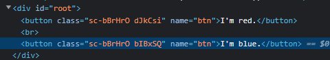
attrs 없이 모든 button에 속성을 주려고 했다면 엄청난 노가다가 필요했을 것이다.
이처럼, styled component는 굉장히 편리한 기능들을 다수 제공한다. 잘 알아두기만 한다면 앞으로의 개발이 훨씬 더 편해질 것이 분명해보인다.
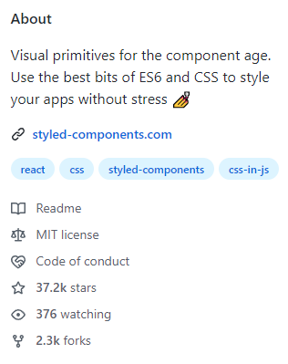
공부하다보니 여기 적힌 기능 외에도 편리한 기능이 상당히 많았고, 37.2k 이상의 스타를 받은 이유를 알 것 같다.
'개발 > Web' 카테고리의 다른 글
| Prettier HTML 태그 자동 줄바꿈 해제하기 (2) | 2022.11.22 |
|---|---|
| [MySQL] 비번 맞게 쳤는데 계속 틀렸다고 할 때 해결 방법 (0) | 2022.09.03 |
| [React 공부] Typescript를 쓰는 이유와 기능 (0) | 2022.08.25 |
| MySQL 설치 에러: Can not perform keyring migration (0) | 2022.08.19 |
| [Windows] MySQL 압축파일(zip) 설치 방법 (0) | 2022.08.18 |